
Identity system / October 2026
Brand guidelines
The symbol, wordmark and applications in motion.
01 / Symbol
The symbol
Five continuous ribbons form one recognisable S. The layers are parts of the symbol, never separate logos.
Original outline


Preserve the original contours and orientation. Neither symbol is a perfect circle.
02 / Wordmark
The wordmark
Use the supplied vector artwork.
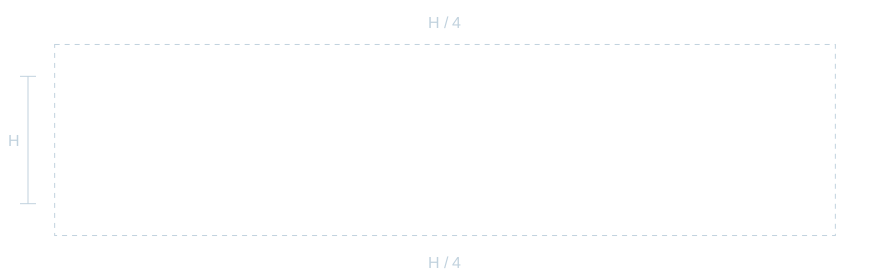
- Fixed proportions
- Vector bounds: 717.01 × 127.36. Scale proportionally.
- Standalone spacing
- Keep H / 4 clear on every side, where H is the visible wordmark height.
- Letterforms
- Keep the custom letterforms and spacing. Do not retype or redraw the wordmark.
03 / Expressions
Two expressions
Choose Outline or Solid according to scale and visual weight.
Outline
Large editorial layouts and open compositions.

Solid
Compact signatures and stronger visual presence.
These are separate drawings. Do not create one by stroking or filling the other.
04 / Clear space
Clear space
Keep x = D / 4 clear around every lockup. D is the visible symbol height.
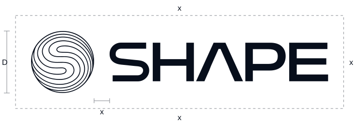
- External space
- Keep text, images and edges outside the boundary on every side.
- Internal gap
- The symbol-to-wordmark gap is also x. Keep it fixed.
05 / Configurations
Logo configurations
Use the supplied lockups. Their proportions and internal gaps are fixed.

Primary horizontal
Default signature. Wordmark height = 5D / 8.
D 128 px · x 32 px · wordmark 80 px

Expressive horizontal
For symbol-led compositions. Wordmark height = 3D / 8.
D 192 px · x 48 px · wordmark 72 px

Stacked
For square and vertical formats. Wordmark height = 3D / 8.
D 240 px · x 60 px · wordmark 90 px
All three configurations are available in Outline and Solid.
06 / Minimum sizes
Minimum sizes
Screen recommendations in CSS pixels. Check legibility at the final size.
Outline symbol
D ≥ 64 px
Solid symbol
D ≥ 48 px

Wordmark
H ≥ 16 px
- Lockups
- Apply the symbol minimum to each lockup. Increase the size if the layers merge.
- Limited space
- Use the standalone wordmark when the symbol is too small. Test print separately.
07 / Logo colour
Logo colour
Use Midnight or White for clear contrast.

Midnight / #070E1B
Use the Midnight master on White or Ice.
White / #FFFFFF
Use the White reverse master on Midnight or Navy.
08 / Palette
Colour palette
Five core colours lead the identity. Steel, Ocean, Coral and Pure black support interface details, sales materials and production.
Midnight 950
#070E1B
Primary dark
Navy 900
#172231
Dark surfaces
Slate 700
#3A4B5A
Supporting text on light surfaces
Ice 200
#C1D2DE
Light surfaces
White
#FFFFFF
Light surfaces and reverse artwork
| Colour | HEX | RGB | CMYK* |
|---|---|---|---|
| Midnight 950 | #070E1B | 7 / 14 / 27 | 74 / 48 / 0 / 89 |
| Navy 900 | #172231 | 23 / 34 / 49 | 53 / 31 / 0 / 81 |
| Slate 700 | #3A4B5A | 58 / 75 / 90 | 36 / 17 / 0 / 65 |
| Ice 200 | #C1D2DE | 193 / 210 / 222 | 13 / 5 / 0 / 13 |
| White | #FFFFFF | 255 / 255 / 255 | 0 / 0 / 0 / 0 |
| Steel 500 | #848F9B | 132 / 143 / 155 | 15 / 8 / 0 / 39 |
| Ocean 600 | #466E84 | 70 / 110 / 132 | 47 / 17 / 0 / 48 |
| Coral | #FF6B5B | 255 / 107 / 91 | 0 / 58 / 64 / 0 |
| Pure black | #000000 | 0 / 0 / 0 | 0 / 0 / 0 / 100 |
- Steel 500
- Muted interface details; avoid small text on light surfaces or the lower dark field
- Ocean 600
- Links and active controls; use sparingly
- Coral
- Sales materials and commercial calls to action, including the website’s waitlist actions and launch milestone; one accent per layout, with Midnight text on it, never White, and never in the logo
- Pure black
- Print and special production requirements
* Confirm CMYK values against the printer’s profile and proof.
09 / Typography
Typography
DM Sans for prose and headings; vector artwork for the wordmark.
Aa
DM Sans
Regular 400 for reading.
Medium 500 for headings and actions.
Aa Bb Cc / 0123456789 / & @
| Role | Size / line height | Weight |
|---|---|---|
| Display | 88–152 px / 0.92 | 500 |
| Section heading | 40–64 px / 1.08 | 500 |
| Introduction | 18–21 px / 1.5 | 400 |
| Body | 17 px / 1.6 | 400 |
| Caption | 13 px / 1.5 | 400 |
| HUD label | 13–14 px / 1 | MatrixType 700 |
- Reading
- Keep paragraphs short and lines around 55–75 characters. On phones, body text is 16 px / 1.6 and section titles are 36 px.
- Notation
- Use MatrixType for HUD labels and date lines, KaTeX Math for θ, φ, t and Δ, and tabular figures for numbers.
10 / Photography
Photography
Choose natural materials, quiet geometry and a clear focal point.
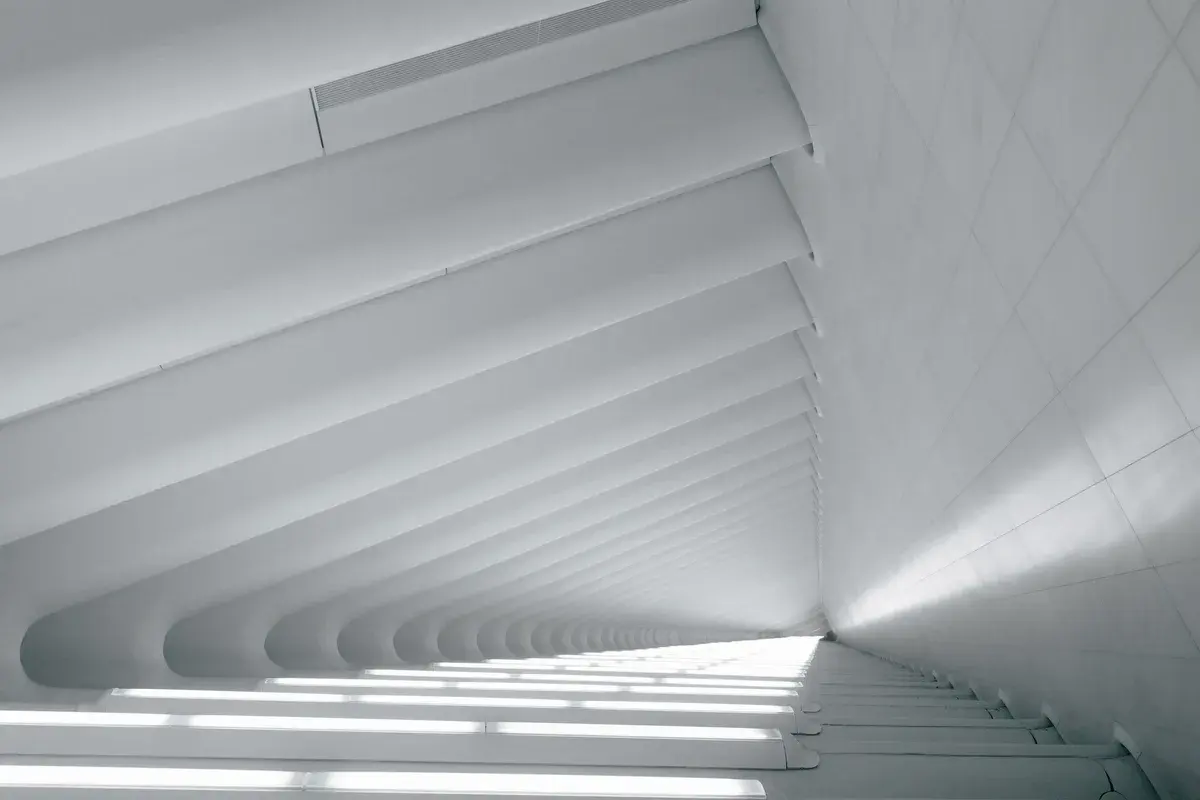
Structure and light
Quiet rhythm, natural tones and a precise crop.
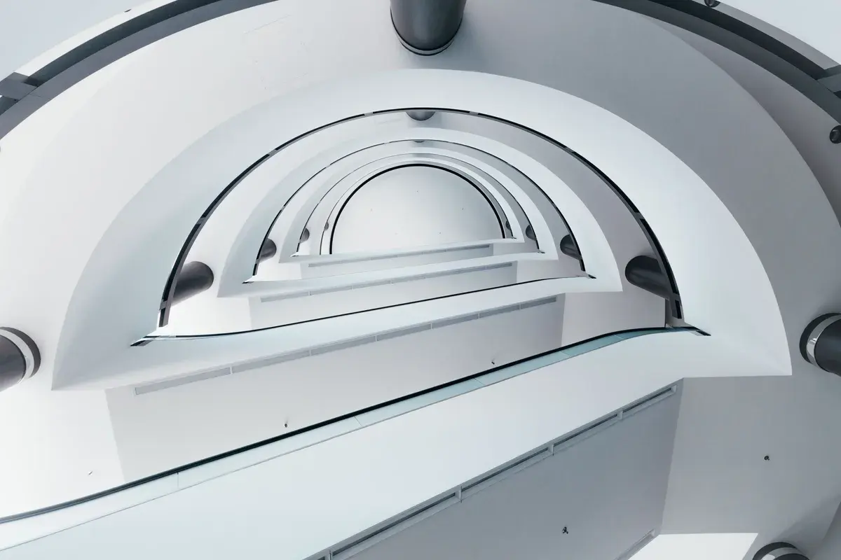
Space for the signature
Let the composition breathe. Keep a clear, contrasting area for the logo.
Use recorded footage for movement imagery. Keep the steel-blue/cyan-to-black field textured with film grain.
11 / Composition
Composition
Give each composition one focal point: a symbol, a wordmark or a short headline.
Do Anything
- Editorial
- Give the logo and message their own space. Lead with Midnight and White.
- Photography
- Place the logo on a clean, contrasting surface.
- Contour crops
- Use contour crops as background graphics alongside a complete signature. Never crop the identifying logo.
12 / Partnerships
Partnerships
Match visible wordmark heights and align optical centres.
Partner
- Alignment
- H is the visible wordmark height. Balance the visual weight of both marks.
- Spacing
- Keep at least H between each mark and the divider, and H / 2 around the lockup. Follow the partner’s rule if it requires more space.
13 / Usage
Use the artwork correctly
Preserve the logo’s form, contrast and clear space.

Avoid / Distortion
Scale every dimension by the same factor.

Avoid / Recolouring
Use Midnight or White. Do not recolour individual ribbons.

Avoid / Rotation
Keep the master in its original orientation.
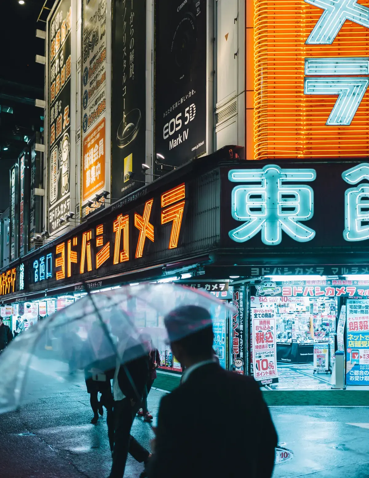
Avoid / Busy background
Vivid colour and dense detail obscure the logo.
Closer than it should be.Avoid / Crowding
Keep text and other elements outside the clear space.
Use / Clear space
Choose calm surfaces and give the complete signature room.
Do not add shadows or glows to logo masters.
14 / Language
Language and motion
Write one idea at a time. Use concrete verbs, short sentences, British English and sentence case.
- Message
- Keep the website headline Do Anything. Use dates, numbers and mechanisms. Avoid slogans, rhetorical questions and exclamation marks.
- Claims
- Use verified product facts. Avoid unsupported claims and invented testimonials or customer counts.
- Motion
- Reveal one idea at a time. Preserve logo proportions and letter spacing. End on a complete, still signature.
- Accessibility
- Let automatic motion settle within five seconds. Provide still frames for reduced motion.
15 / Downloads
Logo files
Nine SVG assets, each in Midnight and White.
Solid symbol

Wordmark
Primary horizontal · Outline

Primary horizontal · Solid

Expressive horizontal · Outline


Expressive horizontal · Solid

Stacked · Outline


Stacked · Solid

Add clear space around the downloaded artwork in your layout.
Download colour specifications · JSON ↓